

Documents
Creating accessible documents ensures that everyone can engage with your content, regardless of ability. This guide will show you how to make Microsoft Word and other text-based documents inclusive by using proper headings, descriptive alt text, and built-in accessibility tools. With these steps, you’ll design documents that are clear, navigable, and compliant with accessibility standards.
Why is it Important?
Accessible documents make it easier for everyone to use and understand your content. When your documents are clear and well-structured, more people can engage without frustration. Simple steps like adding headings and descriptive text help readers find what they need quickly and make learning smoother for all.
Word and Google Documents Essentials
Using strong color contrast allows people with low vision to see your content easier. To check contrast, use the WebAIM contrast checker.
Highest Contrast
Complementary colors (those opposite each other on the color wheel) provide the highest color contrast, making them ideal for text and graphics color.

Lowest Contrast
Analogous colors (those next to each other on the color wheel) provide the lowest contrast and should be avoided.

Adding a Document Title in Microsoft Word
All documents should have a title that represents the content of the document. The Document Title is not the same as a heading on the page. Screen readers announce the Document Title first, helping users understand what the document is before reading content. If no title is set, assistive technology often reads the file name instead, which is frequently unclear or meaningless to students.
- Open your document in Microsoft Word (desktop app).
- Select File from the top‑left menu.
- Select Info.
- On the right side, locate the Title field.
- If it says Add a title, click in the field.
- Type a clear, descriptive document title (not just the file name).
- Press Enter or click outside of the field — the title is saved automatically.

- Open your document in Microsoft Word for Mac (desktop app).
- Select File from the menu bar.
- Select Properties.
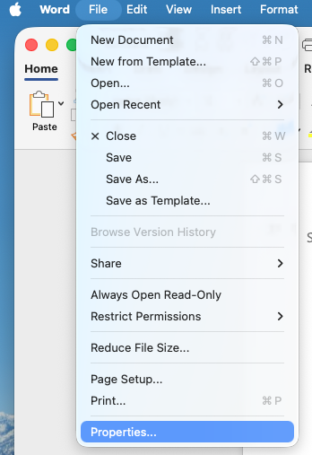
- In the Summary tab, find the field labeled Title.
- Enter a descriptive document title (not just the file name).
- Select OK to save.

In the online version of Word, you cannot edit a document’s Title property in the file metadata. That capability is missing in Word for the web, so Microsoft requires you to open the document in the desktop Word app to add or change the Title field.
- Open the document in Word for the web.
- Go to File → Info → Open in Desktop App.
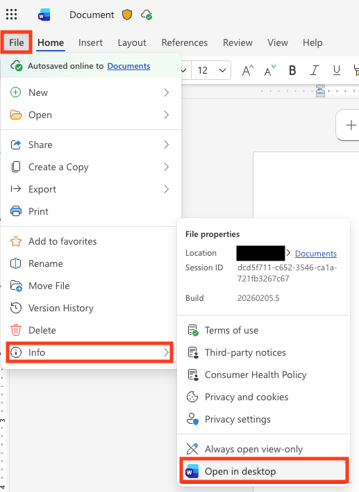
- Update the Document Title
- In desktop Word (PC/Windows) select File → Info → Title, then enter the title.
- In desktop Word (Mac) select File > Properties > Summary tab > Title field, then enter the title.
- Save the document.
Additional Resources
- Accessible Documents (Section508.gov)
- Accessible Documents Training (WebAIM)
- Create accessible documents, spreadsheets, or presentations with Pages, Numbers, or Keynote (Apple)
- Creating Accessible Word Documents (WebAIM)
- Make Your Word Documents Accessible (Microsoft)
- Microsoft Word Accessibility Checker (UNCG)
- Microsoft Office Document Accessibility Videos (Microsoft)
- Use Google Docs Editors with a screen reader (Google)
Last Updated: February 11, 2026