

Color Contrast
Color choices affect readability and accessibility more than you might think. This guide explain how to detect problematic color contrast and make adjustments to improve color contrast to the required 4.5:1 ratio for text and 3:1 ratio for images so your text and visuals meet accessibility standards and remain clear for all users.
Why is it Important?
Adequate color contrast enables learners to process visual information in text and images by distinguishing items from one another. Good color contrast reduces cognitive strain and confusion and makes designs easier to understand. Poor color contrast can make text hard or impossible to read. Appropriate color contrast helps everyone, and it especially supports people who have low vision, color blindness, visual stress, dyslexia, presbyopia (changes to vision that normally accompany aging), and other conditions. Ensuring sufficient contrast between text and background improves visibility, supports assistive technologies, and creates an inclusive experience for every learner.
Checking for Color Contrast
Use a color picker tool to identify the hex codes (6 numbers or letters) of the text and background colors.
Recommended Tools:
- Colorzilla (Chrome | Firefox)
- HTML Color Codes (Web)
- ImageColorPicker.com (Web)
- Mac Digital Color Meter tool (Mac)
- Sip (Mac)
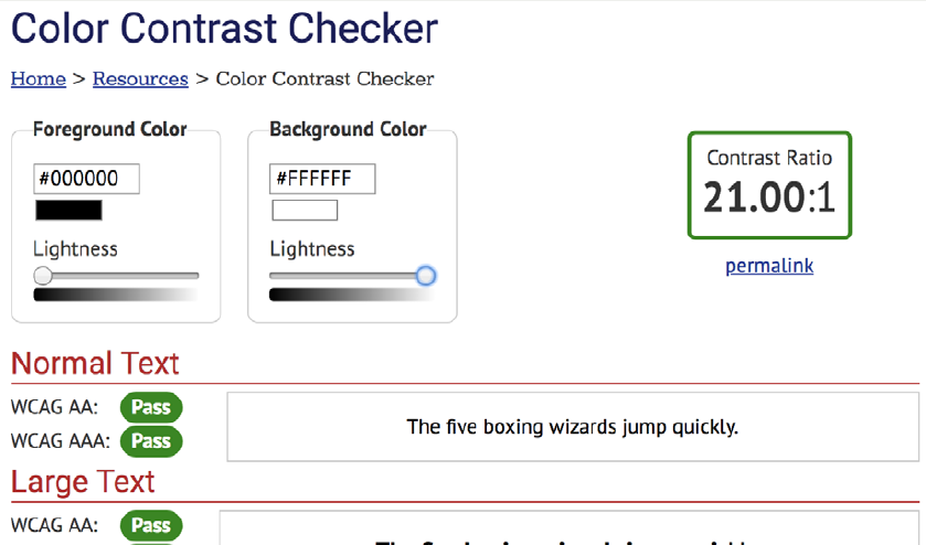
Text hex code is #000000
Background hex code is #FFFFFF

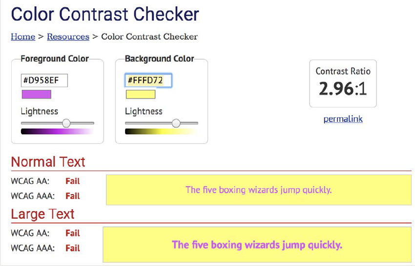
Text hex code is #D958EF
Background hex code is #FFFD72
Note
Font larger than 18pt (24px) requires a 3:1 ratio. Items exempt from color contrast standard:
- Decorative images
- Inactive buttons
- Logos
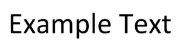
Example of font larger than 18pt (24px)
BIG FONT
Decorative image example

Inactive button example

Logo example

Paste the color codes into a contrast checker tool.
Recommended tools:
Example of Passed Contrast Check
Example of Failed Contrast Check
If color contrast meets standards of 4.5:1 for text and 3:1 for images, you’re all set!
If color contrast fails standards, change the colors to meet standards.
The next sections show how to change colors in Microsoft Office programs and Adobe Acrobat PDFs.
Microsoft Office Colors
The Microsoft Office Accessibility Checker does not check for color contrast.
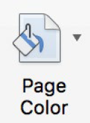
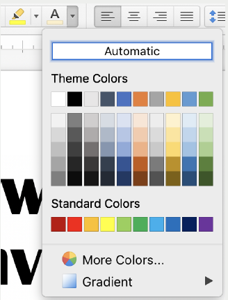
Change text colors, and highlight colors and page color using the icons in the toolbar.
Icons for text and highlighting

Icon for page background
Color options
Adobe Acrobat PDF Colors
Color contrast needs a manual check even with Adobe Accessibility Checker.
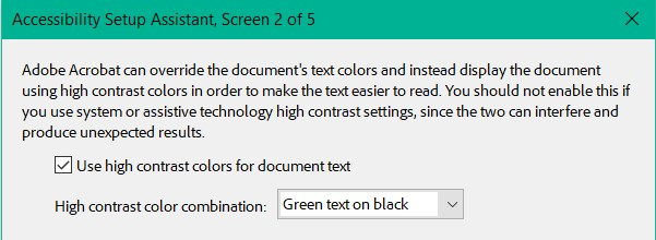
If text color contrast is poor, under Tools, select Accessibility, then Adobe Acrobat Accessibility Setup Assistant. Check “Use high contrast colors for document text.”
If this does not fix contrast issues, edit the document in its original format, such as Word.
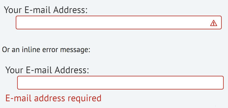
Accessibility standards require that color never be used as the only visual means of conveying information.
Use a second form of emphasis such as bolding text, adding an icon or message, or other techniques.
- The Color section of Getting Started with Accessibility provides additional information on alternative ways to emphasize text.
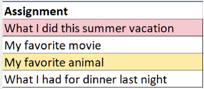
Example #1 from WebAIM.org
The first image relies on color only to show an assignment is missing or late. This is inaccessible to a blind student as well as confusing to a sighted student.
Adding a column explains the purpose of the color, as shown in the second image.
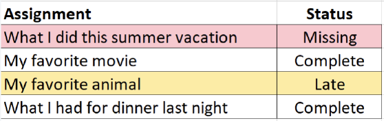
Example #2 from WebAIM.org
Use an icon or additional message as shown in the second image instead of using only red.

Additional Resources
- Making Color Usage Accessible (Section508.gov)
- Test color combinations for WCAG compliance (WebAIM)
- Use color and contrast for accessibility in Microsoft 365 (Microsoft)
Last Updated: December 12, 2025