Making Design Elements Accessible
How To Choose Accessible Fonts
These fonts are recommended because they are most likely to be accessible to all users. Combine a sans-serif font with a serif font in your document or website to create a more appealing design.
ACCEPTABLE FONT TYPES
Sans-serif
Sans-serif fonts are recommended because they have a slightly higher readability than serif fonts. Their appearance is more block-like and less decorative than serif fonts.
Serif
In serif fonts, the tops and bottoms of the letters contain decorative edges called “serifs,” which some say bear a resemblance to little feet. There are many accessible serif fonts, but in general, some are slightly less readable because they contain those decorative elements that sans-serif fonts do not.
OTHER FACTORS TO CONSIDER
Good accessible font types have a certain level of legibility, including good height, width, and thickness. Font availability is also very important. Ideally, it’s best to use a font that is fairly popular and available to most users. Fonts on the “Highly Recommended” list are considered among the highest-rated with regard to readability, legibility, and availability.
Fonts on the “Other Acceptable Accessible Fonts” list are accessible and acceptable, but may be slightly less readable, legible, and/or available for some users.
HIGHLY RECOMMENDED FONTS
- Verdana (sans serif)—used by many accessibility sites
- Tahoma (sans serif)
- Arial (sans serif)
- Georgia (serif)—UNCG brand body font
- Palatino (serif)—UNCG brand body font
- Lucida Sans (sans serif—Windows)/Lucida Grande (sans serif—Mac)
- Book Antiqua (serif)
- Helvetica (sans serif)
OTHER ACCEPTABLE ACCESSIBLE FONTS
- Sofia Pro (sans serif)—UNCG brand body font
- Pluto Sans Heavy (sans serif)—UNCG brand headline font
- Andika (sans serif)—great for print disabilities; free download available
- Calibri (sans serif)
- Century Gothic (sans serif)
- Trebuchet MS (sans serif)
- Times New Roman
- Garamond (sans serif)
- Bookman Old Style (serif)
How to Check for Color contrast
WHAT WILL BE LEARNED?
Learn to detect problematic color contrast and make adjustments to improve color contrast to the required 4:5:1 ratio for text and 3:1 ratio for images.
WHY IS IT IMPORTANT?
Adequate color contrast enables learners to process visual information in text and images by distinguishing items from one another. Good color contrast reduces cognitive strain and confusion and makes designs easier to understand. Poor color contrast can make text hard or impossible to read.
WHO BENEFITS?
Appropriate color contrast helps everyone, and it especially supports people who have low vision, color blindness, visual stress, dyslexia, presbyopia (changes to vision that normally accompany aging), and other conditions
Checking for Color Contrast: How-To Guide
Use a color picker tool to identify the hex codes (6 numbers or letters) of the text and background colors.
Recommended Tools:
- Colorzilla (Chrome | Firefox)
- Sip (Mac)
- HTML Color Codes
- ImageColorPicker.com
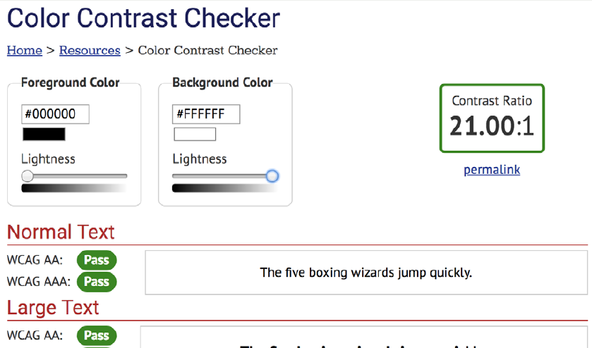
Text hex code is #000000
Background hex code is #FFFFFF

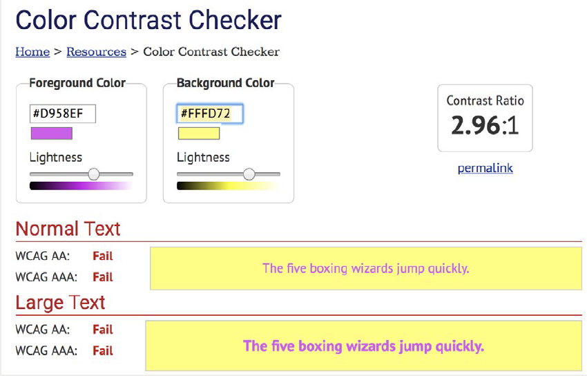
Text hex code is #D958EF
Background hex code is #FFFD72
Note
Font larger than 18pt (24px) requires a 3:1 ratio. Items exempt from color contrast standard:
- Decorative images
- Inactive buttons
- Logos
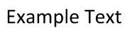
Example of font larger than 18pt (24px)
BIG FONT
Decorative image example

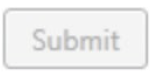
Inactive button example
Logo example

Paste the color codes into a contrast checker tool.
Recommended tools:
Example of Passed Contrast Check
Example of Failed Contrast Check
If color contrast meets standards of 4:5:1 for text and 3:1 for images, you’re all set!
If color contrast fails standards, change the colors to meet standards.
The next sections show how to change colors in Microsoft Office programs and Adobe Acrobat PDFs.
Microsoft Office Colors
The Microsoft Office Accessibility Checker does not check for color contrast.
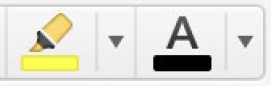
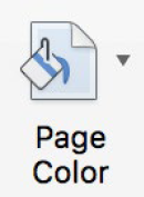
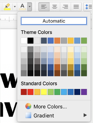
Change text colors, and highlight colors and page color using the icons in the toolbar.
Icons for text and highlighting
Icon for page background
Color options
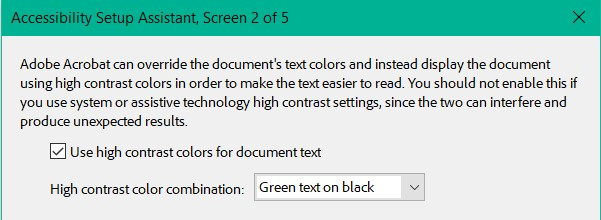
Adobe Acrobat PDF Colors
Color contrast needs a manual check even with Adobe Accessibility Checker.
If text color contrast is poor, under Tools, select Accessibility, then Adobe Acrobat Accessibility Setup Assistant. Check “Use high contrast colors for document text.”
If this does not fix contrast issues, edit the document in its original format, such as Word.
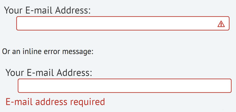
Accessibility standards require that color never be used as the only visual means of conveying information.
Use a second form of emphasis such as bolding text, adding an icon or message, or other techniques.
- The Color section of Getting Started with Accessibility provides additional information on alternative ways to emphasize text.
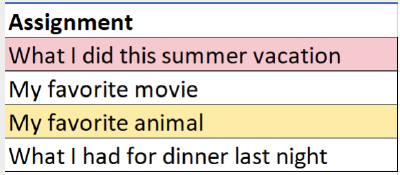
Example #1 from WebAIM.org
The first image relies on color only to show an assignment is missing or late. This is inaccessible to a blind student as well as confusing to a sighted student.
Adding a column explains the purpose of the color, as shown in the second image.
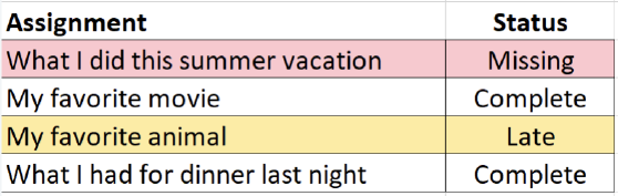
Example #2 from WebAIM.org
Use an icon or additional message as shown in the second image instead of using only red.
How to Create Alt Text
DESCRIPTION
In this How-To, users will learn how to create alt text for images in PowerPoint and Google Slides. PowerPoint and Google have many features built-in that help people with different abilities to read and author documents and presentations. In this short set of slides, learn how to check images and graphics in your slides, making sure they are designed for all students and users of your course content.
WHAT WILL BE LEARNED?
Participants will learn how to create alternate text (also known as alt text) to describe images.
WHY IS IT IMPORTANT?
This is an important skill to know because we often have slides and presentations in our online courses, and knowing they are fully accessible is needed for all student success.
WHO BENEFITS?
This benefits students who are differently abled (specifically those with visual impairments) but also benefits all students through universal design.
Creating Alt Text for Images: How-To Guide
What Is Alt Text?
Alt text (i.e., alternative text) is the text equivalent of the image. It’s particularly important for presentations and documents in an online course or website viewed with a screen reader. Alt text describes the image to the user.
- Alt text is not the file name; it should describe the image and its relevance to content around it.
- If your image is complex (for example, a chart or diagram) and requires a lengthy description, add this description in the accompanying text within the same document or link to a separate document that contains the full text description. This practice is essential for students who use a screen reader and it will be really helpful to other students too.
- How you use alt text in describing an image will depend on the context and how you define its purpose.
The Alternative Text section of Getting Started with Accessibility guide has more information on how to create alt text for different types of images.
PowerPoint: How-To Guide
Open a PowerPoint presentation that has images in it. You can add in alt text for images two different ways.
Select Picture Format. Then select Alt Text.
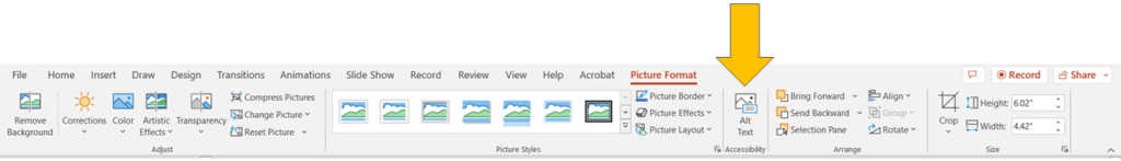
Microsoft PowerPoint will open a screen to add 1–2 sentences for alt text on the right side of the screen. If the image is simply decorative, define or describe it as such.
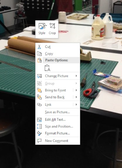
Right click on the image.
Click on Edit Alt Text.
The same screen will pop up on the right side of screen.
Good news! Adding alt text for other MS Office products (Word, Excel, etc.) is done exactly as it’s done in PowerPoint.
Google Slides: How-To Guide
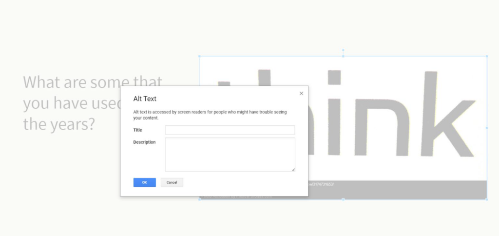
Right click on image. Options will pop up.

Click on Alt Text. A window will open. Type in 1–2 sentences describing the image.
More good news! Adding alt text for other Google products (Docs, Sheets, etc.) is done exactly as it’s done in Google Slides.
WordPress: How-To Guide
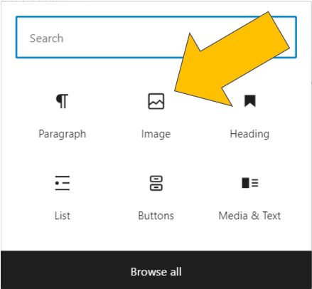
Select Add Block and click the Image option. If no Image option appears, simply type “image” into the search bar.
You can upload an image from your computer, add one from your site’s media library, or add one using an external URL.
Select your image. A block formatting menu will appear on the right side of the page.
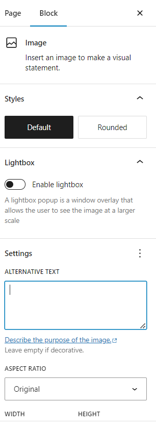
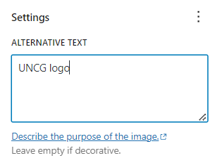
Enter your description in the Alternative Text field (located in the Settings section of your block formatting menu).
What if You Have a Complex Image?
- Some images are more complex, and need more than 1–2 sentences (charts, diagrams, graphs, maps, etc.).
- Give a short description in the alt text box.
- Include a more detailed (or long) description by including it in one of the following ways:
- Surround the image with the long description (usually in a caption underneath the image).
- Link to another section of the document (e.g., appendix) or to an accessible page (e.g., web page, Google Doc/Slide, etc.).
- The National Center for Accessible Media has examples of Long Description for Complex Images.
Are Your Images Accessible?
Have you gone through the listed steps in this how-to guide?
Have you adequately described each of your images as explained in the Alternative Text section of Getting Started with Accessibility?
Have you typed in alt text for all of your images?
If the answer is “yes” to each of the above questions, then your images should be accessible and ready to use in an online class setting or webpage.