Starting at the Beginning

If you are just starting to learn about accessibility and starting from the beginning, you’re in the right place! It’s not easy knowing where to begin with making your content accessible. While there are many issues that need to be addressed, being familiar with the basic fundamentals of accessibility is a great place to begin in making your content accessible to everyone.

Identifying Existing Accessible Content

By identifying existing accessible content, you may save yourself time and effort and have the peace of mind that all individuals will be able to learn from the content. You may wish to start by exploring sources of already accessible third-party content.

Whether you need to find existing accessible content or you plan to create/modify your own, be sure to follow the 7 basic elements of accessible content as you develop and assemble your content.

7 Basic Elements of Accessible Content

Below you will find best practices for the 7 basic elements for creating accessible content: 1) text, 2) color, 3) headings and structure, 4) hyperlinks, 5) alternative text, 6) tables, and 7) multimedia (video/audio). Each of these elements must be considered when developing and sharing content of all types, including documents, presentations, web pages, multimedia and more.

Quick Links

Text

Text is critical when attempting to convey information to others. Text is everywhere—in documents, presentations, web pages, multimedia, etc. Whatever method you use, text will likely accompany the primary way you present information to your audience. Here are some tips to remember to ensure you are creating accessible text:

Use real text instead of images or graphics of text

Each individual word of real text can be highlighted, copied, and pasted; images of text cannot. This means real text can be read by a screen reader, which gives those who are blind or have a visual impairment access to the text. Also, screen magnifying software users will be able to easily and clearly magnify the real text. When magnifying an image of text, it sometimes results in a degraded, pixelated, low-quality image, which would make it difficult to see for the person who needs it magnified. In the first example below, the image of the text is not accessible by a screen reader. The second example of the real, text typed out is accessible.

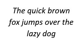
Example 1: Image of text

Not accessible: words cannot be selected individually


Text "The quick brown fox jumps over the lazy dog"

Example 2: Real, typed text

Accessible: words can be highlighted individually


The quick brown fox jumps over the lazy dog

Use simple, readable fonts

Try to use fonts that are most likely to be installed on most computers. It is best to avoid cursive or decorative fonts because they are hard to read. Information on how to choose an accessible font is discussed further in the Making Design Accessible portion of this site.

Make sure text size is readable and appropriate in its context

For documents, text size would ideally be no less than 11 point font, presentations no less than 18 point font.

Use a limited number of font styles per document or web page

There are no definitive rules on how many font styles to use in one document or web page, but using more than 3 can become distracting or “busy” to some readers. According to WebAim, “Documents with no more than 2 or 3 font styles look more organized, streamlined, and coherent.” For most documents and web pages this would mean using one font style for headings and a different font style for text. For example, using an Arial font for your headings and a Georgia font for your text can provide structure and order to your document or web page. Please note this suggestion to limit the number of fonts used is specific to the text in your document or web page; logos and images that have text in them would not be included.

Don’t capitalize large amounts of text

When a lot of words are capitalized together (or all caps), the words often appear to be jumbled together, making it difficult for many people to read. Also, using all caps online is often the equivalent to yelling. See the “Color” section of this page for alternatives to using all caps.

Avoid using blinking or moving text

While this is not used much anymore, it is best to avoid blinking or moving text as it can be distracting to readers, making it hard to read your content.

Provide explanations for abbreviations and acronyms

Screen readers do not recognize abbreviations and acronyms and will read them as if they are words. For example, a screen reader will read “ITS” as “It’s.” Here are a few ways to address this:

  • Organizations, departments, programs, and other abbreviations should be spelled out on first reference, with the abbreviation in parentheses. For example, the School of Education (SOE) should be spelled out on first reference followed by its abbreviation, and then SOE can be used on subsequent references if necessary. 
  • Avoid less common techniques such as adding periods between letters or spelling phonetically, as these are not the generally accepted style and will probably be more confusing than helpful. 
  • Create a key (great for documents that have unusual or a lot of abbreviations/acronyms).
  • Keep your audience in mind. If there is a chance for confusion, take the time to provide clarification within the sentence or paragraph. Make sure to consider adaptive technology and test with screen readers and braille readers if possible. 

Color

Color can be an important component in conveying your content’s meaning to your audience. If used appropriately with other techniques for conveying information, you’ll be able to provide an inclusive experience for all users. Here are best practices that will ensure everyone can fully access your content:

Do not use color alone to convey important information

Using color alone to convey your message will exclude many readers from your content. Color is often used to convey importance, to distinguish text, and to help the reader focus on specific information. Color can be used for these purposes, but to include all readers, it should be used along with another tactic.

The following video shows an inaccessible and an accessible example of how to use color appropriately with text to convey meaning.

Video: Use Color and More to Convey Meaning

Provide Good Color Contrast

Color must also have the appropriate contrast so readers with low vision and color disabilities are able to fully access your content. Text, images, links, buttons, icons, etc. must have the appropriate contrast to its background. Without good color contrast, many people will find it hard to read, navigate, and interact with your content. This could range from a frustrating experience with your content to a complete inability to access your content. The following video further explains how to use color appropriately:

Video: Web Accessibility Perspectives: Colors with Good Contrast

Avoid using red and green colors

People with color vision deficiencies (color blindness) have the most difficulty seeing red and green. Readers who are color blind will have trouble reading/viewing your content if you use shades of red or green for your foreground or background color.

Use a Color Contrast Checker

A color contrast checker can help ensure that your foreground/background colors meet the appropriate ratio. See Checking for Color Contrast for more information.

Headings and Structure

Structuring your document or web page provides organization to your content and allows the reader to easily view the order and navigate through your content. Headings and structure give the reader a preview of what to expect from your content. This benefits both sighted readers and those who use screen readers and other assistive technologies that depend on structure to navigate through a document or web page. If not properly structured, people using assistive technologies can miss important information because they will not receive the same cues as a sighted person. Whether you are creating a document or web page, follow these best practices to ensure all users can access and navigate through your content:

Use only one “Heading 1” style

This style is typically used for the title or main content heading and a screen reader or other assistive technologies identify it as such. This style should not be used for any other headings in your document or web page.

Use a hierarchy to structure your document or web page

This gives your content order, which can be easily read by a screen reader or other assistive technology. Here’s a typical hierarchy structure:

  • Heading 1: page title or main content heading (used only once)
  • Heading 2: major section headings (typically used more than once)
  • Heading 3: subsection of Heading 2
  • Heading 4: subsection of Heading 3
  • Heading 5: subsection of Heading 4
  • Heading 6: subsection of Heading 5
  • Bullets and Numbered lists: use these under any heading (other than Heading 1), specifically when listing items or information is appropriate

Make sure headings are nested properly and that you don’t skip any headings (for example, don’t jump from Heading 1 to Heading 3). Skipping headings will confuse your readers, particularly those who are using a screen reader.

Use the pre-formatted Heading tools in your software

Microsoft Office, PowerPoint, Google Docs/Slides, Canvas and many other commonly used software have pre-formatted heading tools that are easy to use. These pre-formatted tools also come with built-in order and hierarchy systems, which makes it much easier to use while developing your content. Most pre-formatted tools also allow you to view your headings through a navigation or outline pane. Selecting this option will place your ordered headings on the left side of your screen.

Check the reading order of your headings

This ensures that your headings are functional, make sense, and will be read in the appropriate order. This is especially important for people who rely on a screen reader to access your content.

Use headings for structure only

Headings should not be used for text formatting. This means they should only be used to divide information for the purpose of organizing it into meaningful sections. For example, if your Heading 2 style is bold and blue, you should only use this style because it will divide your content into a meaningful section of your document/web page; you should NOT use it because you want this particular text in your document to be bold and blue. You can always change the default formatting of your heading. You could change Heading 2 in the above example from the blue/bold text formatting to black text with 14 point font. This would allow you to use the blue/bold formatting to emphasize important text in your document without using the Heading 2 style.

Resources

Video: Adding Headings to Documents, Improve Accessibility with Heading Styles by Microsoft
Website: Creating Accessible Document Headings by WebAim

The accessibility of hyperlinks is very important but also fairly simple to create. The text within the hyperlink is critical because it should accurately describe where the hyperlink will take you when it is clicked. It serves as a preview to the upcoming information when the link is clicked, but most importantly, it alerts persons using a screen reader to the readable link. The more descriptive the link, the more helpful it is to the reader. For sighted readers, a descriptive link will be retained easier than the URL web address would be. The descriptive link is also much easier to comprehend when read by a screen reader compared to the URL web address, which often reads as jumbled unintelligible letters and symbols. Best practices for accessible hyperlinks include:

Concise

Using short, easy-to-read text in your hyperlink will help your audience quickly scan it to determine if they want to click and read the content. Longer links will take longer to read and often take up more space in your document/web page, requiring more than one line.

Good description

Your hyperlink needs to clearly describe what information your audience will read when they click the link. A short, clear description will entice readers while longer descriptions can cause readers to lose interest.

Avoid using phrases such as “Click here,” “Read more,” and other similar phrases for your hyperlink text. These are unnecessary and don’t give the reader any information about what to expect when they click the link.

Use readable links, not URLs

URLs are hard to read and are usually very lengthy. Screen reader users have an especially hard time understanding URLs because they often include numbers, symbols, and words all combined together. Descriptive links are more user-friendly and readable for everyone.

Video: Word: Links by GCFLearnFree.org

Alternative Text

Alternative text (also known as alt text) is a text description of an image (often invisible to sighted users) that is read aloud to people who use screen readers. Alt text gives meaning to images and allows screen reader users to access your content. Alt text is used for images and graphical objects in documents, presentations, webpages, and other electronic communications. Here are some examples of images that require alt text:

  • Pictures
  • Audio and video objects
  • Embedded objects
  • Images of text
  • Graphs
  • Charts
  • Shapes

How you use alt text in describing an image will depend on the context and how you define its purpose.

Decorative images

Most images require a description because they are connected in some way to the content. However, if an image is considered to be decorative, alt text is not needed. There are two instances where this would occur:

  • Adding alt text would be redundant. This is most often seen on web pages. For example, alt text is not needed for an image that is connected to hyperlink text because the image is already being described by the linked text. Example:
  • Image is purely decorative. These images are not as common, but when they are used, alt text is not necessary. Examples include borders, decorative bars, and other design embellishments meant to improve the look but have no connection to your content. Let’s use a Christmas flyer as a decorative image example. If you use a red bow as decoration on your Christmas party flyer, the red bow does not need alt text because it is purely decorative and does not serve as a visual representation for any information in your flyer. Example:
""

Informative/Example images

Images that are used as a visual example of information that has been described in the text must include alt text for that image. These images are most common and are found in all forms of communication. How the image is described depends on the context in which you as the author intend to use it. The description should be short, no longer than 150 characters, and provide a simple meaning for the image that is being shown. Here are two examples:

Informative Image #1

historical photo of Abraham Lincoln

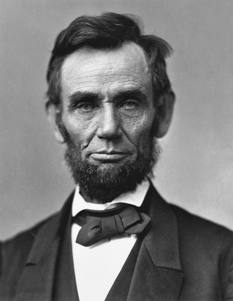
“Abraham Lincoln, sixteenth President of the United States, was born near Hodgenville, Kentucky on February 12, 1809. His family moved to Indiana when he was seven and he grew up on the edge of the frontier. He had very little formal education, but read voraciously when not working on his father’s farm. A childhood friend later recalled Lincoln’s ‘manic’ intellect and the sight of him red-eyed and tousle-haired as he pored over books late into the night.”

Except taken from American Battlefield Trust—Civil War Biography

  • Poor alt text: Abraham Lincoln seated, dressed in a suit and bowtie. Image is black and white.
  • Good alt text: Abraham Lincoln
  • Reason: Leave out irrelevant details, and keep it short. Based on the surrounding text, the purpose of the picture is to simply provide an image of Abraham Lincoln. It is not necessary to include what he’s wearing, the image colors, and that he’s seated because this information is not relevant to the text.

Informative Image #2
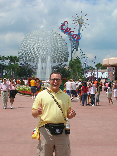
man wearing fanny pack and tourist clothes smiles in front of disney epcot center and crowd

Fanny Pack Antics is a humorous website that takes an irreverent look at the fashion faux pas of the wild, and often wooly, tourist. From the ubiquitous Fanny Pack to the omnipresent mullet, you’ll find plenty to guffaw over.

As you might guess, a few of the website’s targets can be found traipsing along the pathways of Walt Disney’s various theme parks.” Excerpt taken from: The Disney Blog

  • Poor alt text: Tourist
  • Good alt text: Fanny pack tourist at Epcot Center
  • Reason: Include clear, concise details to make the alt text useful to the reader and to supplement the text. In this example, labeling the image as “Tourist” is not enough because the image includes details that support the text. Describing the tourist and the location provides a clearer description of the visual information that is portrayed in the image because the image supplements the text.

Complex images

Complex images contain a lot of information through their visual presentation. Details to describe the image will require more than a short phrase or sentence; it will require a two-part approach:

  • Short description in the alt text field (as described in the Informative/Example images section)
  • Long description provided in the appropriate area—see How to Create Alt Text for more details

There are many types of complex images, but the most common ones include:

  • Charts
  • Diagrams
  • Graphs
  • Maps

Determining what type of image you have and how to describe it

Ask yourself these questions when trying to determine what type of alt text you need for your image:

  • When considering how to describe your image, ask: What do I want the reader to learn from this image?
  • If the image is removed, would the quality of the content be diminished? Would the message be diminished or changed if the image is removed? NO indicates the image is decorative.
  • Is the image used as a visual example of something that is discussed in the main text? Is the image fairly simple to describe? If YES, this indicates the image is informative/example.
  • Is the image used as a supplement to something that is discussed in the main text? Is the image very detailed?Will it require more than 150 characters to fully describe? YES indicates a complex image.

Help with Creating Alt Text

Here are several helpful resources for creating good, appropriate alt text for your images:

Tables

In order for tables to be accessible to all users, specific structural elements must be in place. A properly structured table benefits students who rely on a screen reader or other assistive technologies to access information.

Use your software’s built-in tools

Creating tables can be fairly easy if you use the built-in tools within the software you’re using to structure your table. MS Office has great built-in features for creating accessible tables, and Canvas also has features you can use to create accessible tables. Use the Creating Accessible Tables in Canvas and Creating Accessible Tables for step-by-step guides.

Keep your table simple

Tables should be kept as simple as possible, using basic data or information that can be logically displayed in a table. Keep the following structural features in mind when creating a simple table:

  • Create a title and header row (data tables only).
  • Don’t nest tables within a table.
  • Avoid split and merged cells.
  • Avoid leaving cells blank; to control spacing, adjust your cell spacing.
  • When a cell must be left blank, identify it as “blank.” (To visually hide this, you can change the text color to match the background.)

Check your table’s reading order

The content should make sense when read from left to right, top to bottom because this is the order in which a screen reader will read the information. You can check the reading order by tabbing through the table to make sure it flows logically in the order you intend.

Data tables vs. layout tables

There is some debate about whether tables should be used for data only. While using tables for data rather than to create page layouts is often best for accessibility, you don’t have to completely rule out using layout tables. There are some distinct differences between the two in their purpose and how they are created.

Data tables

Data tables show a relationship between at least two items displayed in rows and columns. These items can be numbers, words, measurements, observations, categories, etc. that show a connection to each other in some way. To be accessible, data tables should follow all of the tips listed in the previous sections. The following video shows an example of an accessible data table read by a screen reader:

Layout tables

Layout tables do not show a relationship between the information listed in them and their primary purpose is to format and position elements in a document or page. Because they don’t represent relationships between information, layout tables do not need titles or headers. To be accessible, however, they do need to follow all of the other previously listed tips in this section. Of these tips, proper reading order is most essential. Screen readers read information in a table in a linear manner; information will be read left to right, top to bottom. The content in your layout table must progress in a logical order—you can check this by tabbing through your table to ensure the order makes sense and flows logically.

Best practices discourage using layout tables to create web pages, but if you choose to do so, World Wide Web Consortium (W3C) recommends using CSS-based layouts to ensure accessibility. Per W3C, CSS-based layouts maintain the defined semantic meaning of the HTML table elements.

Multimedia (Video/Audio)

Multimedia in the form of presentations, video, or audio recordings, etc., are great educational resources. They can be accessible to everyone if certain essential elements are considered when creating or securing your materials.

Common Accessibility Issues with Multimedia

Some audience members will have any one of the following accessibility challenges.

VISUAL
Accessibility Challenge:

Unable to SEE some or all aspects of a page’s visual content.

Solutions:

  • Audio description. Enables user to hear narration of the visual content that isn’t described in the original soundtrack.
  • Keyboard accessible. Enables user to access the screen and controls by screen reader and keyboard instead of mouse.
  • Transcript. Enables user to hear (via screen reader) narration of both visual and auditory content.

AUDITORY 
Accessibility Challenge:

Unable to HEAR some or all aspects of the auditory content.

Solutions:

  • Closed captioning. Enables user to read captions of the auditory content.
  • Transcript. Enables user to read text of auditory content.

MOBILITY 
Accessibility Challenge:

Unable to fully NAVIGATE controls/screen using a mouse.

Solutions:

  • Keyboard accessible. Enables user to access the screen and controls by keyboard instead of mouse.

Accessible Multimedia Essential Elements

To be fully accessible, multimedia must have the following essential elements:

  • Captions and transcripts for audio content.
  • Descriptive language is used in the video (if creating your own) or audio descriptions are added for any visual content not described in the original soundtrack.
  • Good color contrast between text and background.
  • Clear, concise alt text for any images.
  • Keyboard navigation for media controls (pause/play/rewind, etc.).
  • Media players (if required for viewing) are operable via keyboard and accessible by screen reader.

How to Ensure your Multimedia is Accessible

Use these helpful how-to guides to make sure your multimedia is accessible:
Creating Accessible Videos
How to Create Transcripts
DIY Captioning
Request Captioning Services
When and How to Use Audio Descriptions

Fully Accessible Multimedia Example:

Here’s an example of how audio description can provide full access to a video for users who have a visual accessibility challenge. This YouTube video has no verbal dialogue; only background music and the audio description of the non-verbal action that’s occurring on the screen. Also the video is accessible by keyboard and a link to the transcript can be found below the video:

Transcript: Hunger Games with Audio Description

How-to Guides: Step-by-Step Instructions
for Making Accessible Content

If you are looking for instructions for a specific topic, you’ll find a collection of how-to guides to refer to when creating various types of accessible content including:

You may be interested to learn how to check accessibility of existing content you’ve found or created for accessibility. You can also learn to design for accessibility by focusing on fonts, color contrast, and alt text. Each guide includes step-by-step instructions to teach you how to design, create, and check content for accessibility to all users.

Unsure if your content is accessible?

Check out these Checking for Accessibility tools and steps.