Get step-by-step instructions on how to create PowerPoint presentations that are accessible to everyone. PowerPoint is the tool most commonly used for creating presentations, and it has many features that will make your presentation accessible to all users.
Who benefits?
All users will benefit from accessible PowerPoint presentations; but users with visual, auditory, or mobility disabilities will specifically benefit.
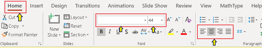
Built-in slide layouts have content placeholders (the boxes you use to type text) that automatically make sure that the reading order works for everyone.
If videos are used in your presentation, audio description (narration added to the soundtrack) will be required for any important visual details that are not verbally described in the video soundtrack.
Reading order is very important to those who use screen readers because it ensures that the user receives the information in the order you intended. PowerPoint automatically defaults to the order in which you insert boxes on your slide.
Learn how to make your Keynote presentations as accessible as possible by using pre-designed themes; formatting master slides and styles; adding alt text to images, charts and graphs; and creating unique titles for each slide.
Why is it important?
Accessible presentations are about ensuring readability, usability, and navigability for everyone. The right delivery will ensure participants gain the most possible out of the presentation.
Who benefits?
Viewers who use a screen reader and those with mobility impairment will benefit the most from an accessible Keynote presentation. However, a presentation’s accessibility can also benefit hearing-impaired users and those with vision impairments, such as color blindness, that don’t require a screen reader.
How-To Guide: Accessible Keynote Presentations
Choose from pre-defined themes rather than creating your own. If you purchase or download additional themes, request accessibility information from the designers.
Make sure you select a theme that has good contrast and does not contain busy backgrounds, which make text difficult to read.
Set the language for screen readers to read the presentation.
Choose Language & Region from the File > Advanced menu. Choose the language for the presentation.
Use pre-defined slide layouts rather than creating your own.
Click Add Slide and choose an appropriate layout from the drop-down list.
If you want to customize slides, including font and size, colors, etc. make changes to the Master Slides rather than to individual slides.
Click View and Edit Master Slides. Click Edit Master Slides from the dialogue box.
Choose the slide layout you want to edit, and use Keynote’s formatting tools to edit the slide. If you edit text formats and want all text of that type to have the new format, click Update next to the style name.
Use a unique title for each slide. This is easy to see in Outline View.
From the toolbar, click View and then Outline.
Body text should be included in the outline view too.
Add Alt Text to each image, chart, or graph in your presentation.
Click on the image, click Format on the toolbar, then click Image. In the Description field, enter the alt text for the image.
Include extended descriptions on the slide itself.
Make sure any tables you use are accessible.
Select the table. In the Format pane, click on Table. Indicate how many columns and rows contain headers in the table.
Keynote does not have an accessibility checking feature. You could export it to another format (PowerPoint, PDF, HTML) and check its accessibility using PowerPoint’s accessibility checker, Acrobat’s accessibility checker, or the WebAIM Wave accessibility checker (HTML).
Choose Export To from the file menu and select the format you want to use to check the presentation’s accessibility.
Avoid animations and slide transitions. These are difficult for screen readers.
Avoid automatic slide transitions. These are difficult for screen readers and other assistive technologies.
Avoid using text boxes not pre-defined in the theme.
Provide captions for videos included in a presentation.
Use a color scheme with a sharp contrast between text and background.
Make sure text is not too small, especially if the presentation will be displayed on a projector.
Do not use color as the only way to convey information.
Learn to create digital forms that all people can use by checking for instructions, cues, required form field settings, formatting requirements, and form navigation.
Why is it important?
Without accessible forms, some users may be too frustrated or confused to complete the form or may fill it out incorrectly.
Who benefits?
Everyone benefits from a clear, well-designed, organized, functional form. Having clear instructions, logical navigation between fields, and cues for required items helps avoid frustration and extra effort for everyone.
Creating Forms Using a Web-based App
Using a web-based app is a quick and easy way to create forms. This option allows you to be creative and have control over your form without performing some of the technical, behind-the-scenes work that makes the form function properly. You do not have to be a web developer to use a web-based app to create your form.
Creating Forms Using HTML Markup
If you need to create a form directly on a webpage, you’ll need to use HTML markup.
How-To Guide: Accessible HTML Forms
HTML forms are often seen on webpages (at UNCG WordPress and Canvas are most common). If you need to create a form for your webpage using HTML, you will need to follow the steps in this tutorial to ensure that your form is accessible.
Organize your form in a logical way, by grouping similar questions together and using headings for each section.
If a form is long, choose to spread it over multiple pages. Use a progress bar to indicate progress.
Whenever possible, include options to undo actions or allow the user to confirm their responses in case a user has made an error.
If you are coding a form yourself, ensure every form field has a <label> element.
If you are using a tool like Qualtrics, these tools may include appropriate HTML markup.
Example: HTML Labels
<div>
<label for=”last_name”>Last name:</label>
</div>
Use help text, which can help users know what is being asked and specify a format.
<span id=”Time-help”>Use decimals instead of time. Example: .25 means 15 minutes, .5 means 30 minutes.</span>
For groups of related fields such as radio buttons or checkboxes, use a <fieldset> element to group them together and a <legend> element to describe them.
Again, tools like Qualtrics may include appropriate HTML markup.
Qualtrics is another option for creating forms. It also collects and reviews data and has many useful reporting features. Qualtrics has advanced questions, analysis, and reporting features. It can be used for surveys, registrations, quizzes, evaluations, ticketing/request forms, etc. To be fully accessible to all users, several steps must be incorporated in the design of your Qualtrics form.
How-To Guide: Accessible Qualtrics Forms
Selecting a theme from the Qualtrics Library will help ensure your form’s theme is accessible to all users.
Click the Library button. (This defaults to your My Library folder.)
Click the drop down for your default folder (upper left corner) and select Qualtrics Library.
Some question types are more accessible than others.
Organize your form in a logical way, by grouping similar questions together and using headings for each section.
If the form is long, choose to spread the forms over multiple pages. Use a progress bar to indicate progress.
Include options to undo actions or allow user to confirm their responses in case a user has made an error.
Use Auto-Number feature to number your form to help users navigate through your form and keep track of the questions.
Select Tools from the Survey tab.
Choose Auto-Number Questions.
Optional: Change the prefix from Q to something else.
Changing the default survey title gives the user more information about the form and makes it easier to identify. This text appears in the browser as the window or tab title.
Navigate to the Survey tab and open Survey Options.
Enter a new Survey Title and press the Save button.
Adding an accessible header to your form lets you insert content at the top of each page. The header is typically used as the form’s title and/or logo.
Navigate to the Survey tab and open the Look and Feel menu.
Click the General tab and then click Edit underneath the Header box.
Click Source in the Header box (brings up the HTML screen) and type your text in between <h1> and </h1>.
Here’s an example: <h1>Test Form 1/4/18</h1>
Click Save.
You must include alt text for any images on your form.
Insert image into the Rich Content Editor and right click on the image.
Select Image Properties.
Enter a short description of your image.
Click OK.
By default, the Next and Previous buttons appear as “>>” and “<<” to indicate arrows. Changing these to text will help those who use screen readers.
Go to the Survey tab and open Look & Feel.
Click the General tab and go to the Next Button Text box; replace arrows with text (e.g., Next).
Do the same for the Previous Button Text box (replace arrows with Back).
Click OK.
This feature checks for inaccessible issues and gives recommendations on how to fix them.
From the Survey tab, click Tools/Review/Check Survey Accessibility.
Review the list of problems and recommendations.
Click directly on a recommendation to jump to its location in the survey; make the suggested changes.